The most basic display elements on a HTML page are easy to understand: paragraphs, headings and tables. Often, a page is broken up into sections where each section contains these elements; these sections can be defined in the HTML source as blocks. The problem that arises from this is how to display the separate sections in an intuitive manner.
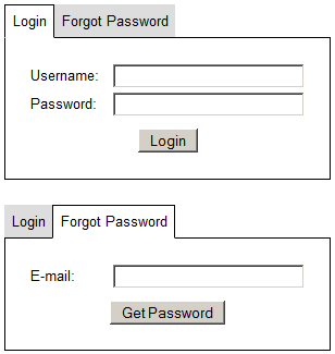
An example would be a login form, on which you can provide a username and password to log in. Another section of the page provides a "forgot-password" form, where an email address can be entered and a retrieval email sent. This page may be written in two sections, as below.
Two-section login form
<h2>Login</h2>
<form action="/login" method="post">
 <fieldset>
  <legend>Provide login details</legend>
  <label for="user">Username:</label><input type="text" name="username" id="user">
  <label for="pass">Password:</label><input type="password" name="password" id="pass">
  <input type="hidden" name="do" value="login">
  <input type="submit" name="go" value="Login">
 </fieldset>
</form>
<h2>Forgot Password</h2>
<form action="/login" method="post">
 <fieldset>
  <legend>Provide e-mail</legend>
  <label for="email">E-mail:</label><input type="text" name="email" id="email">
  <input type="hidden" name="do" value="forgot">
  <input type="submit" name="go" value="Get Password">
 </fieldset>
</form>
Having these two forms directly in line with each other could cause some confusion for the user. There are a few ways to alleviate this: bringing the two forms alongside each other, for example, would allow a visual separation of the two functions. The most effective display method in this situation, however, is tabbing.
The tab system
It's very likely that you've come across tabs before: they've been used by web browsers for many years as a way to display multiple pages in the same browser window. There are two components to a tabbing system: the tab list and the tab contents. Each entry in the tab list has an associated content block: when a given entry in the tab list is selected, the content block for that entry is displayed and the other content blocks are hidden away.
In the above example, four separate pages are open in the same web browser instance: the second is selected. As can be seen, it's obvious which tab is selected, and which contents are being displayed as a result. Tabs aren't just a graphical concept, however: they can be used equally well in a text-based environment.
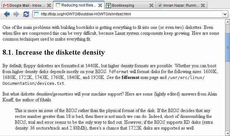
In this example, four terminals are open in the multiple-terminal screen, and each one has an entry on the tab list at the bottom. The third terminal (an editor session) is currently selected, and the tab list reflects this by highlighting the third tab.
Tabs in a web page are visually very similar to these two interfaces; the above example of a login and forgot-password interface may be implemented as per the following diagrams.
Implementation: HTML
As stated above, the tab contents must be sectioned before tabbing can be
applied; a tab list must also be present to allow switching between tabs. A
simple way to break the content down is by placing each section in a
DIV. The correspondence between tab list item and tab content is
maintained by giving each DIV an id, which is used
as the rel attribute on the list item. As described in the
JavaScript section, the tab switcher will use this rel to
determine which tab content to switch in.
Two-section login form, with tab code
<ul class="tablist" id="tablist-login">
 <li rel="tab-login">Login</li>
 <li rel="tab-forgot">Forgot Password</li>
</ul>
<div class="tab" id="tab-login">
 <form action="/login" method="post">
  <fieldset>
   <legend>Provide login details</legend>
   <label for="user">Username:</label><input type="text" name="username" id="user">
   <label for="pass">Password:</label><input type="password" name="password" id="pass">
   <input type="hidden" name="do" value="login">
   <input type="submit" name="go" value="Login">
  </fieldset>
 </form>
</div>
<div class="tab" id="tab-forgot">
 <form action="/login" method="post">
  <fieldset>
   <legend>Provide e-mail</legend>
   <label for="email">E-mail:</label><input type="text" name="email" id="email">
   <input type="hidden" name="do" value="forgot">
   <input type="submit" name="go" value="Get Password">
  </fieldset>
 </form>
</div>
Implementation: CSS
Each tab in the tablist can be in one of two states: active (the currently selected tab) or inactive. In the above example, the tab list has been coded as an unordered list, which means that the list items must be floated next to each other if they are to appear on the same line.
The tab content DIV is a simple matter to style: a black border
will suffice. The tab list, however, has to be positioned such that the
"active" tab will visually merge with the tab contents. The easiest way to do
this is to give the active tab and the tab content box the same background (in
this case, white), and to set a bottom border on the active tab of white. From
here, the tab list can be positioned to overlay the tab content, causing the
active tab's white border to visually override the content's black border.
In CSS, the implementation could be as follows.
CSS for tab rendering
/* Tab list: no bullets */ul.tablist { list-style: none inside; margin: 0; padding: 0; }/* Tab list item: floated, pushed down one pixel */ul.tablist li { display: block; float: left; background: #ddd; border-top: 1px solid #ddd; border-bottom: 1px solid black; position: relative; bottom: -1px; padding: 0.5em; margin-right: 2px; cursor: pointer; }/* Tab list item (active): white bottom border */ul.tablist li.active { background: white; border-left: 1px solid black; border-right: 1px solid black; border-top: 1px solid black; border-bottom: 1px solid white; }/* Tab: black border */div.tab { border: 1px solid black; clear: both; padding: 0.5em; }
Implementation: JavaScript
The most important part of the tabbing system is the active component: that part which switches in a tab and switches out the others, when an item on the tab list is clicked. In order to do this, a mapping must be maintained of which tab list items are in a particular list; this map can be created at the time the page is loaded.
At initialisation time, each item in a tab list is also given an
onclick function, to activate the switching mechanism when the
tab is clicked by the user. The mechanism is a simple loop, determining which
tab content boxes are to be switched, and hiding every tab except the one
requested.
JavaScript tab switcher
tabSwitcher = {
  _map: {},

  init: function()
  {
    // Check each UL on the page, to see if it's a tablist
    lists = document.getElementsByTagName('ul');
    for(i=0; i<lists.length; i++)
    {
      if(lists[i].className.indexOf('tablist') >= 0)
      {
        // If we find a tablist, put each item in the map
	items = lists[i].getElementsByTagName('li');
	for(j=0; j<items.length; j++)
	{
	  // Map the item's REL attribute to this tablist
	  tabSwitcher._map[items[j].getAttribute('rel')] = lists[i].id;

	  // When the user clicks this item, run switcher
	  items[j].onclick = function()
	  {
	    tabSwitcher.action(this.getAttribute('rel'));
	    return false;
	  };
	}

	// Leave this tab list in a default state of
	// first item active
	tabSwitcher.action(items[0].getAttribute('rel'));
      }
    }
  },

  action: function(target)
  {
    // Fetch all the tab list items in the same list as the target
    tablist = document.getElementById(tabSwitcher._map[target]);
    listitems = tablist.getElementsByTagName('li');

    for(k=0; k<listitems.length; k++)
    {
      // If this item's REL is the same as the clicked item,
      // activate the tab list item and show the content
      rel = listitems[k].getAttribute('rel');
      if(rel == target)
      {
        listitems[k].className = 'tab_hi';
        document.getElementById(rel).style.display = 'block';
      }

      // Otherwise, make the tab list item inactive and hide the content
      else
      {
        listitems[k].className = 'tab';
        document.getElementById(rel).style.display = 'none';
      }
    }
  }
};

window.onload = tabSwitcher.init;
Putting all these code sections together provides:
- Login
- Forgot Password
Advanced usage: Multiple tab lists
Since the above JavaScript code is designed to map a tab list item to the list within which it's contained, it's possible to place multiple tab lists on the same page, and have each work independently; the tab switcher will maintain the relations to the appropriate tab lists in its internal map. This can be used for a detailed drill-down display, or any other point at which a tab list could be nested within another tab.
The styling of tabs can also be enhanced, to make judicious use of rounded tabs, colouring and the like; since the styling has been separated from the presentational HTML, restyling the tabs is merely a matter of changing the CSS used to define the tab styles.
Imran Nazar <tf@oopsilon.com>, 2009